Sydney’s streetscapes are about to get a fresh wave of personality in 2026. Homeowners are leaning into bolder expression, deeper connection to nature, and a more curated approach to architectural heritage. Rather than a one‑palette‑fits‑all moment, colour trends are becoming more nuanced—tailored to the era, form, and feeling of each home.
Four themes are shaping the year ahead: moody tones, high‑contrast accents, warm neutrals, and nature‑inspired palettes. Each brings its own energy, and when paired thoughtfully with iconic Australian housing styles—Federation, Mid Century Modern, Coastal/Hamptons, Californian Bungalow, and Terrace homes—they create exteriors that feel both contemporary and deeply rooted in place.
Moody Tones: Depth, Drama and Sophistication
Moody colours are having a major resurgence in 2026, driven by a desire for grounding, cocooning spaces that still feel refined. Think charcoal greens, inky blues, ironstone greys, and deep clove browns. These tones work beautifully across several architectural styles, but the key is balance.
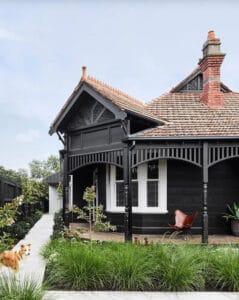
Photography: Sharyn Cairns
Federation Homes
Federation architecture thrives on ornate detail—verandah fretwork, leadlight windows, terracotta roofs. Moody tones can modernise these homes without erasing their charm.
Deep eucalyptus or charcoal trims paired with warm brickwork create a sophisticated update.
For weatherboard Federation cottages, a rich blue‑black exterior with crisp white detailing feels elegant rather than heavy.
Mid Century Modern
This style embraces boldness, so moody tones are a natural fit.
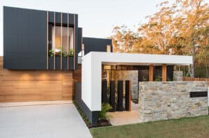
Try a saturated olive or graphite façade with timber soffits and stone accents.
A matte charcoal front door against pale brick adds instant architectural weight.Modern Home with moody tones. Builder: Mark Winter Constructions
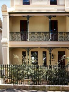
Terrace Homes
Terrace houses LOVE drama.
Deep navy or smoky plum on the façade highlights iron lacework and tall proportions.
Pairing moody tones with warm lighting softens the look at night, giving the home a welcoming glow.
High-Contrast Accents: Crisp, Clean and Architectural
Contrast is becoming sharper in 2026, but not in the stark black‑and‑white way of the late 2010s. Instead, homeowners are using contrast to highlight form, not dominate it. Expect to see dark trims on light façades, pale stone against deep cladding, and bold front doors that act as sculptural elements.
Coastal / Hamptons Houses
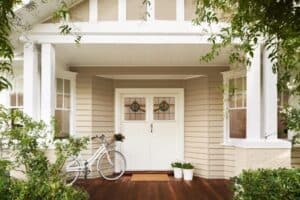
The Hamptons look is evolving.
Instead of pure white with navy, we’re seeing soft greys or warm whites paired with deep sea‑green or storm‑blue trims.
High‑contrast shutters or gables create a crisp, coastal feel without tipping into cliché.
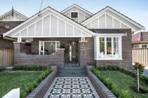
The Californian Bungalow
These homes shine when their architectural lines are emphasised.
A warm neutral base (think greige or sandy taupe) with chocolate‑brown or charcoal accents on beams and window frames adds definition.
Terracotta roofs pair beautifully with high‑contrast detailing, grounding the palette.
Terrace Homes
Contrast is a powerful tool for terraces, especially in dense urban streets.<
A pale façade with black steel balustrades feels modern yet timeless.
Alternatively, a dark façade with light stone steps or pale window reveals creates a striking, contemporary edge.
Warm Neutrals: Comfort, Calm and Timelessness
After years of cool greys dominating exteriors, 2026 is all about warmth. These neutrals feel sun‑kissed, earthy, and inviting—perfect for the Australian climate and lifestyle.
Federation Homes
Warm neutrals soften the ornate details without washing them out.
Creamy limestone, warm oatmeal, and muted clay tones complement red brick and terracotta roofs.
Soft taupe trims feel more modern than traditional white.
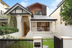
Builder: Cordony Group
Coastal / Hamptons
Warm neutrals bring a more Australian interpretation of the Hamptons look.
Think driftwood beige, warm white, and sandy cream.
These tones pair beautifully with natural stone, pale timber, and brushed nickel hardware.
Californian Bungalow
This style thrives on warmth.
Honeyed neutrals, muted caramel, and soft mushroom tones enhance the bungalow’s low‑slung, grounded feel.
Pair with lush planting for a relaxed, welcoming exterior.
Nature-Inspired Palettes: Biophilic, Organic and Local
Homeowners are increasingly choosing colours that reflect the landscapes around them—bushland greens, coastal blues, sandstone neutrals, and earthy ochres. These palettes feel authentic and timeless, especially when paired with natural materials.
Mid Century Modern
Nature‑inspired tones align perfectly with the style’s indoor‑outdoor ethos.
Olive, sage, and muted clay pair beautifully with stone walls and timber battens.
A soft eucalyptus exterior with black steel accents feels fresh and architectural.
Coastal / Hamptons
Nature‑inspired doesn’t have to mean green.
Soft ocean blues, seafoam, and dune neutrals create a calm, breezy palette.
Weatherboard homes look especially beautiful in these tones, with white or warm‑grey trims.
Terrace Homes
Urban homes benefit from nature‑inspired grounding.
Deep green façades with brass hardware feel luxurious and contemporary.
Sandstone‑inspired neutrals honour the heritage of many inner‑city suburbs.
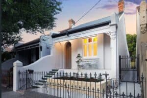
Historical terrace with timeless character. Photographer: Anson Smart
Bringing It All Together
The biggest shift in 2026 is intentionality. Homeowners aren’t choosing colours because they’re trendy—they’re choosing palettes that honour the architecture, connect to the landscape, and express personality.
A few guiding principles for the year ahead:
Let the home’s era lead the palette, not the other way around.
Use contrast to highlight form, not overwhelm it.
Lean into warmth—it’s more flattering in Australia’s light.
Draw from nature for longevity and harmony.
Don’t fear moody tones—they can be incredibly elegant when balanced with texture and light.
For more goodness and advice on renovations check out our articleshere OR get social with ouramazing FB community
Leave a Reply
Gerard
I am painting my Californian Bungalow over from a deep cream to now Dulux Birkenshire white.
I can’t decide on the fascia.
I have tried – Reckless grey, Hammer Grey, Deep Ocean, Spanish olive, Spanish Cream half

I am painting my Californian Bungalow over from a deep cream to now Dulux Birkenshire white.
I can’t decide on the fascia.
I have tried – Reckless grey, Hammer Grey, Deep Ocean, Spanish olive, Spanish Cream half
All I am not happy with. ……Help!!!!